


")


Bathrooms can be difficult spaces to decorate, even when we have planned them from scratch ourselves. They are often small and awkward and there is not always a lot to work with when it comes to décor. After all, the bathroom is a practical room that we use for washing ourselves and sometimes our clothes (if the room doubles as a laundry)
But bathrooms don’t have to be dull and boring. If you enjoy soaking in a hot bath, the bathroom can become a haven of peace and solitude. It can also become a place where you can pamper yourself and unwind and relax.
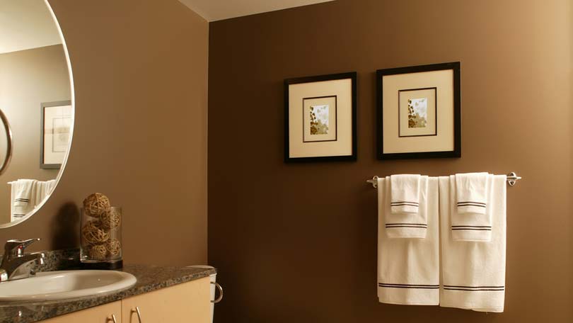
When it comes to bathroom color schemes, the starting point will usually be the bath and sanitary ware. For this reason, white or a low key champagne-color, are probably the safest options. The problem with installing colored baths and sanitary ware is that they tend to date the room. The same applies to fancy or colored tiles. But when you introduce color in other ways, you can change the color scheme relatively easily without incurring huge costs.
So how can you introduce color into your bathroom?
Probably the easiest way is to paint the walls, but you can also introduce color with blinds or curtains that pick up the same accent as towels, facecloths and so on.
If you have a carefully thought out color scheme for the rest of your home, you may want to follow this through to bathrooms, toilets and shower rooms. This is a safe approach and one that works particularly well for en suite bathrooms that lead off bedrooms. But you don’t have to take this approach. You may decide that the bathroom should be in complete contrast to the rest of the house. Just be sure you can live with it.
Remember that colors have different effects, and presuming you want a haven of peace and tranquility, you should choose a color that will help you achieve this effect. Color is an enormously powerful medium and it will help if you know something about color theory, and how colors work together and on their own.
First of all, it’s important to realize that color has a definite effect on our emotions, even though we might react differently to other people. Sensitivity to color may also differ according to the culture in which we have been raised, as well as our general upbringing. It is also often affected by age and our physical well being. For example, a sick person will feel more comfortable in a neutral room rather than a room that features bright colors.
The psychological impulses that most of us have to color are linked to primitive associations with nature. Even though strong, vibrant colors like purple, red and dark royal blue may suggest splendor and joy, red can imply danger. Like fire, it stimulates the brain and is exciting, but too much of it can make us feel restless. Blue is like ice, and it is said to reduce excitability. But it is also mysterious and if we use too much of it, it can induce melancholia. Blue can also be a difficult color to work with because there are so many different tones. A pure cyan (which is more like a sky blue) will be a lot more soothing than a violet-hued blue that has lots of red in it. Yellow is the sunshine color and it is cheerful and commands attention. Green is associated with leaves and grass and growing plants. It is peaceful and cooling, and can be beautifully calming. If a mellow shade of green is used, it can also have a nostalgic effect. Ochre, mustard and various browns are quite literally of the earth, and so they are warm, invigorating, cheerful and strong.
Before you tackle bathroom color schemes, it is also helpful to know the difference between warm and cold colors, as well as the so-called ‘non-colors’, black, white and grey.
The famous scientist Sir Isaac Newton (1642-1727) developed what we now refer to as the color wheel, which is a great educational tool. He was studying the effects of a beam of light shining through a glass prism when he realized there were 12 basic colors from which every possible hue comes from.
The color wheel is a spectrum, like the rainbow, only it is joined at both ends (making the wheel). There are three primary colors – red, yellow and blue – and three secondary colors that are produced when each of the primary colors is mixed with one other primary color, in equal amounts. Red and yellow make orange, yellow and blue make green, and red and blue make purple. Then there are six tertiary colors, produced when a primary color is mixed with its closest secondary color: yellow-orange, red-orange, red-violet, blue-violet, blue-green and yellow-green. The primary colors are the most intense of all. Secondary colors are more intense than tertiary colors but less intense than primary colors.
When white is placed next to or between two colors you will see the true value of these colors. But white is also a balanced mixture of each color of the spectrum, and so it can be used successfully as an accent. This is why one color plus white works so well in interiors, and bathrooms are no exception – for example white sanitary ware plus a color works every time. Black, another of the three non-colors, can be somber and overpowering on its own, but it can be successful as an accent. Black tiles combined with white sanitary ware in the bathroom will create a dramatic effect. Grey is neutral and colorless, although blue-grey can be very effective and soothing. If you’ve experimented with paint, you will probably know that equal amounts of complementary colors will always produce grey!
When you start working on bathroom color schemes, remember that warm colors like red and yellow will have the effect of making the room feel warmer. Cool colors like green and some blues, will have the effect of reducing temperature.
Lastly, you need to remember that colors will change according to the way they are used with other colors. For example if two colors are used next to one another, the initial intensity and effect of that color might change. Different textures of the same color will also have different effects. The rougher the surface, the more color it will absorb. So if you have a shiny tile on the walls or floor, and match the color to a textured fabric that is exactly the same color, they will appear different. Even a shiny tile and a matt tile of the color will appear different. This isn’t a bad thing because it will have the effect of creating interest.
Also, colors get their true value from clear, bright natural light. Dim light will tend to neutralize colors while artificial light will change the color. Incandescent light will tend to produce a yellow cast while fluorescent lights might make colors bluer than they would otherwise appear. This is important especially when bathrooms don’t have a lot of natural light, which is often the case.


